Accessible Data Science for the Blind Using R
Three Available Packages Specialized for Visually Impaired R Users
There are three packages for the blind R users (Godfrey, Warren, Murrell, Bilton, & Sorge, 2020; Seo, 2020; Siegert & Williams, 2017).
Accessible Math Test
The following shows an accessible Math created by R along with MathJax:
\[\frac {2} {3} \]
\(3+2=5\)
\[ 3*2=6 \]
\[5^2=25\]
Basic Histogram
See Figure 1 made by R base:
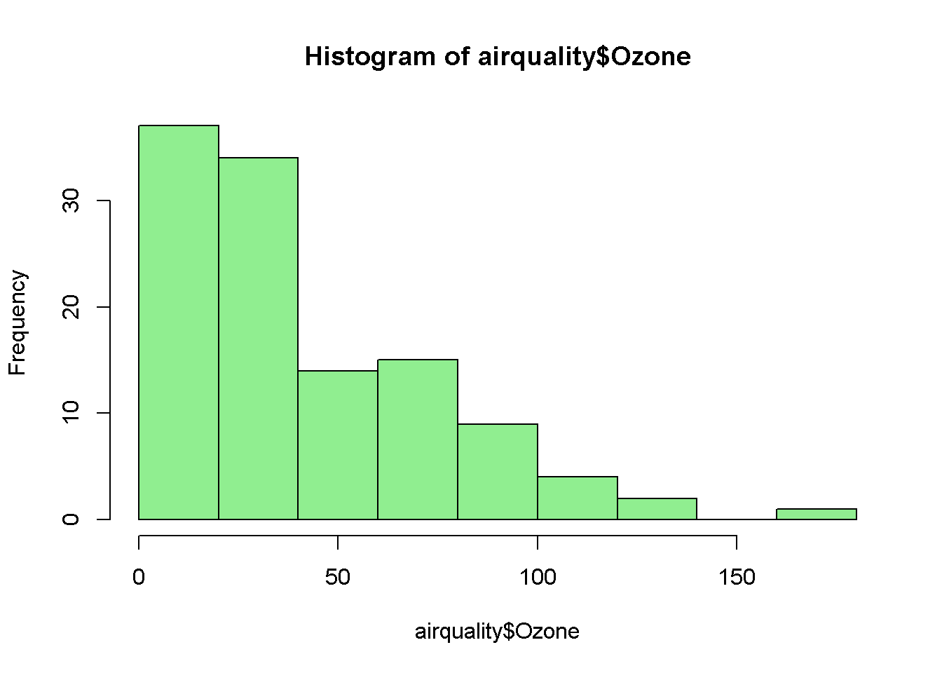
Figure 1: Histogram of Ozone.
VI(hist(airquality$Ozone))## This is a histogram, with the title: Histogram of airquality$Ozone
## "airquality$Ozone" is marked on the x-axis.
## Tick marks for the x-axis are at: 0, 50, 100, and 150
## There are a total of 116 elements for this variable.
## Tick marks for the y-axis are at: 0, 10, 20, and 30
## It has 9 bins with equal widths, starting at 0 and ending at 180 .
## The mids and counts for the bins are:
## mid = 10 count = 37
## mid = 30 count = 34
## mid = 50 count = 14
## mid = 70 count = 15
## mid = 90 count = 9
## mid = 110 count = 4
## mid = 130 count = 2
## mid = 150 count = 0
## mid = 170 count = 1You can sonify the scatterplot as follows:
sonify(1:5, 1:5)Ggplot
Data Visualization
See Figure 2 created by ggplot2 (Wickham et al., 2020), ggthemes (Arnold, 2020), and plotly (Sievert et al., 2020) packages.
Figure 2: Population Growth: An Example Line Chart.
Data Textualization
The following is the textualized version of the graph above using VI() function of BrailleR package (Godfrey et al., 2020):
VI(g)## This chart has title 'Population Growth'.
## It has x-axis 'Month' with labels Jan, Feb, Mar, Apr, May, Jun, Jul, Aug, Sep, Oct, Nov and Dec.
## It has y-axis 'Population' with labels 280,000, 290,000, 300,000, 310,000 and 320,000.
## There is a legend indicating that colour is used to represent factor(year), with 16 levels:
## 2000 represented by colour light greenish blue,
## 2001 represented by colour dark greenish blue,
## 2002 represented by colour brilliant blue,
## 2003 represented by colour very light blue,
## 2004 represented by colour vivid bluish green,
## 2005 represented by colour light bluish green,
## 2006 represented by colour strong reddish brown,
## 2007 represented by colour strong yellowish pink,
## 2008 represented by colour light gray,
## 2009 represented by colour white,
## 2010 represented by colour white,
## 2011 represented by colour white,
## 2012 represented by colour white,
## 2013 represented by colour white,
## 2014 represented by colour white and
## 2015 represented by colour white.
## The chart is a set of 16 lines.Data Tactualization
Please refer to the following video that explains tactileR package (Seo, 2020).
References
Arnold, J. B. (2020). Ggthemes: Extra themes, scales and geoms for ’ggplot2’. Retrieved from http://github.com/jrnold/ggthemes
Godfrey, A. J. R., Warren, D., Murrell, P., Bilton, T., & Sorge, V. (2020). BrailleR: Improved access for blind users. Retrieved from https://CRAN.R-project.org/package=BrailleR
Seo, J. (2020). TactileR: Converting r graphics into a braille ready-to-print pdf. Retrieved from https://github.com/jooyoungseo/tactileR
Siegert, S., & Williams, R. (2017). Sonify: Data sonification - turning data into sound. Retrieved from https://CRAN.R-project.org/package=sonify
Sievert, C., Parmer, C., Hocking, T., Chamberlain, S., Ram, K., Corvellec, M., & Despouy, P. (2020). Plotly: Create interactive web graphics via ’plotly.js’.
Wickham, H., Chang, W., Henry, L., Pedersen, T. L., Takahashi, K., Wilke, C., … Dunnington, D. (2020). Ggplot2: Create elegant data visualisations using the grammar of graphics. Retrieved from https://CRAN.R-project.org/package=ggplot2
JooYoung Seo
Ph.D. Candidate (ABD) in Learning, Design, and Technology
My research topics include STEM education, computational thinking and accessible makerspaces.